Menu Engineering for Profitability: A Complete Guide
Menu engineering analyzes dish profitability and popularity to classify items as Stars, Plowhorses, Puzzles, or Dogs. Strategic pricing, design, and data-driven updates guide customers to profitable choices, boosting restaurant revenue. This approach, using Indian Rupees, helps balance customer satisfaction and profitability effectively.
8/3/20255 min read


In today's fiercely competitive restaurant landscape, your menu is more than just a list—it's a powerful, dynamic tool for driving profitability, shaping guest experiences, and influencing orders. Welcome to menu engineering, where creativity meets data, and every dish speaks to your bottom line as well as your customers.
Whether you’re a restaurateur, chef, manager, or a food business enthusiast, mastering menu engineering can dramatically improve your restaurant’s profit margins. In this comprehensive guide, we’ll break down dish-level margins, show you how design and pricing influence choices, and walk you through practical visualizations—including contribution margin charts and menu quadrant maps—all with realistic examples in Indian Rupees.
What is Menu Engineering?
Menu engineering is the systematic process of evaluating and optimizing your menu’s performance based on the profitability and popularity of each item. It’s about finding the sweet spot between what guests love and what brings in profit, and then applying design psychology and strategic pricing.
Menu engineering typically involves:
Analyzing dish-level contribution margins
· Assessing the popularity of each dish
· Categorizing items into strategic quadrants (Stars, Plowhorses, Puzzles, Dogs)
· Redesigning and repricing the menu to nudge the right decisions
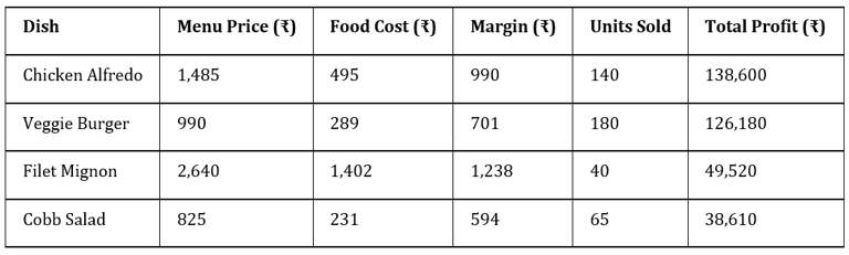
1. Analyzing Dish-Level Margins (in ₹)
What is a Contribution Margin?
The contribution margin is the money left over from the selling price after subtracting a dish’s food cost. This is how much each sale "contributes" toward paying fixed costs (like rent and salaries) and, ultimately, profit.
Formula:
Contribution Margin (₹) = Menu Price (₹) - Direct Food Cost (₹)
Example:
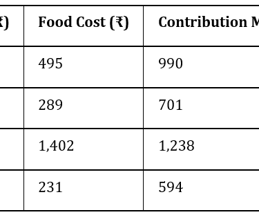
If your Chicken Alfredo sells for ₹1,485 and costs ₹495 to make, its contribution margin is ₹990.
Steps to Analyze Dish-Level Margins
1. Collect Data:
o Menu Price (₹)
o Food Cost (₹): Cost of all ingredients per plate.
o Sales Data: Number of each dish sold in a fixed period.
2. Calculate Contribution Margin for Each Dish:
o Use the formula for every menu item.
3. Rank by Popularity and Margin:
o Now you have the two data points you need: margin and number sold.
Visual: Contribution Margin Chart
You can immediately spot that Filet Mignon has the highest margin, but Veggie Burger wins in popularity.
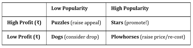
2. Mapping Items with the Menu Engineering Matrix
This matrix divides dishes by profitability and popularity into four key groups:
· Stars: High profit, high popularity
· Plowhorses: Low profit, high popularity
· Puzzles: High profit, low popularity
· Dogs: Low profit, low popularity
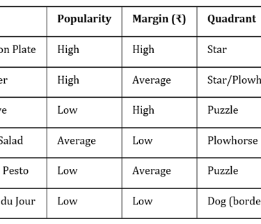
Visual: Menu Engineering Quadrant Map
How to Categorize:
· Find the average margin and popularity.
· Star: Above average on both.
· Plowhorse: Popular but below average margin.
· Puzzle: High margin but not popular.
· Dog: Neither.
Example Category Assignment:
Filet Mignon (₹1,238 margin, 40 sold) is a Puzzle. Chicken Alfredo (₹990, 140 sold) is a Star.
3. What To Do With Each Category
Stars: Draw attention! Feature them, but don’t overprice or drop quality.
Plowhorses: These are beloved but not very profitable. Tweak costs, nudge up the price, or bundle.
Puzzles: High margin, low sales. Improve position, rename, or train staff to recommend.
Dogs: Review for removal or reformulation.
4. How Menu Design Influences Choices
Menu psychology is about guiding, not tricking, guests.
· Prime menu locations: Top right or first/last positions in a section attract most attention.
· Visual anchors: Borders, boxes, icons focus eyes on high-margin dishes.
· Descriptive language: “Char-grilled, locally sourced steak” beats “Steak Plate.”
· Decoy effect: A premium dish (e.g., Tandoori Lobster, ₹2,800) makes your ₹650 Butter Chicken seem reasonable.
· Fewer choices: Streamlined menus speed decisions and often boost satisfaction.
5. The Art of Menu Pricing
Pricing is part math, part psychology.
· Avoid price grids: Guests just scan and choose the cheapest.
· Drop the ₹ symbol (sometimes): “360” is less painful than “₹360.”
· Price endings: Whole numbers (“390”) feel premium; “389” suggests value.
· Anchor pricing: List one extra-high-priced item to make mid-range dishes look reasonable.
6. Contribution Margin Analysis: Bringing It All Together
Once you’ve:
· Calculated all margins,
· Ranked sales and profitability,
· Assigned items to quadrants,
· Optimized your menu design,
You can now visualize the impact of each dish.
Visual: Contribution Margin Scatter Plot
· X-axis: Units sold
· Y-axis: Contribution margin per dish (₹)
· Bubble size: Total monthly profit (units sold × margin)
Dishes in the upper right with the biggest bubbles are your profit powerhouses.
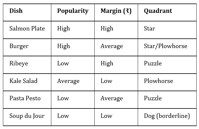
7. Step-by-Step Example: Engineering a Real Menu
Suppose you run a bistro with these numbers:
· Average Margin:
(990 + 743 + 1,155 + 537 + 764 + 495)/6 ≈ ₹780.67· Average Units Sold:
(130 + 165 + 45 + 80 + 72 + 55)/6 ≈ 91
Now, assign quadrants:
· Stars: Salmon Plate (high margin & popularity), Burger (high popularity, close to avg margin).
· Plowhorses: Kale Salad and Soup du Jour (popular, lower margin).
· Puzzles: Ribeye (good margin, low popularity).
· Dogs: All move reasonably well—no “dogs.”
8. Menu Redesign and Price Optimization
With the insights above, you can:
· Feature Salmon Plate and Ribeye with visuals and better descriptions.
· Rework Plowhorses (Kale Salad, Soup du Jour’s costs or portions).
· Refresh Ribeye’s appeal, pair with a special sauce, or offer as a limited-time chef’s special.
· Consider rotating out low performers, even if none qualify as Dogs for now.
9. Visual Summary: Quadrant Map Example
10. Frequently Asked Questions
Q: What about drinks and sides?
A: Analyze them in exactly the same way! Many Indian beverages have excellent margins.
Q: How often should I update?
A: At least quarterly, or when ingredient costs or customer trends shift.
Q: Is this just for full-service restaurants?
A: Not at all—these principles apply to cafés, cloud kitchens, and beyond.
Key Takeaways
· Menu engineering blends financial analysis with human psychology.
· Contribution margin (₹) is the key measure for dish-by-dish profitability.
· Mapping the menu with matrixes and visual tools reveals where to focus.
· Design and pricing strategy subtly steer guests to your most valuable items.
· Adjust and optimize your menu regularly for the best results.
Visuals
Example Contribution Margin Chart (₹)
Quadrant Map
To visualize, use a scatter or bubble chart with the above data.
Your menu is a living document—a sales pitch, a profit map, and a culinary story in one. With these menu engineering techniques and rupee-driven analysis, you’re ready to turn your menu into a profit powerhouse. Happy menu-optimizing!
For a complete menu analysis, use your POS system’s data and update recipes with your latest ingredient costs. Don’t hesitate to run a staff taste-test and involve your team—they know customers best and can be powerful advocates for change.